Home Film My Art
Art
Other: (Travel, Rants, Obits)
Links About
Contact
This essay was written for, and appears in,
the catalogue Angela Schlaud, published 1998. The work
discussed in, and illustrated in, this essay was shown along with
other works by Schlaud,
at Lyons
Wier Gallery in Chicago, November 13 through December 19,
1998. The catalogue can be obtained through the gallery, and a review of the show
can be found on ArtScope.net .
ANGELA SCHLAUD
by Fred Camper
Radiant with splashes of color, alive with lines and curves,
Angela Schlaud's paintings and watercolors can be a bit
deceptive: they are not only the pleasantly messy, seductive
objects that a first glance would suggest. The colors are bright
and supple enough to be suggestive, the complex lines musically
expressive, and yet rather than the lyrical abstractions of
Arthur Dove or Paul Klee, whom she cites as two major influences,
it is Willem de Kooning's heterogeneous paintings of the 1970s
that her work brings to mind. Compositions that seem almost
sweetly unified when glanced from across the room also seem, for
all their gentle unassertiveness, to also be pulling themselves
apart.
Yet these works succeed because their unifying forces are as
strong, and as deep, as their centrifugal ones. The
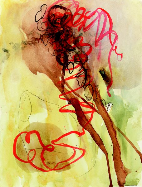
watercolor 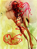 Bandwidth
(1998, watercolor, graphite, gouache, and ink, 16 X 12
inches) sings with organic lines and shapes — an almost
calligraphic curving red line, translucent brown streaks, a pale
yellow field. At the same time that one starts to notice how
utterly different the shapes are from each other, one also
notices that the colors, which at first glance appear as separate
shades of red, tan, yellow, and blue-gray, actually work to unify
the image. The light yellow is also present in somewhat darker
shades, which glide into the lighter shades of tan — they
are even superimposed at the lower left — which in turn lead
to the darker shades of tan, which themselves contain hints of
the red. Rather than a series of contrasts, then, Schlaud's
colors also suggest a continuum.
Bandwidth
(1998, watercolor, graphite, gouache, and ink, 16 X 12
inches) sings with organic lines and shapes — an almost
calligraphic curving red line, translucent brown streaks, a pale
yellow field. At the same time that one starts to notice how
utterly different the shapes are from each other, one also
notices that the colors, which at first glance appear as separate
shades of red, tan, yellow, and blue-gray, actually work to unify
the image. The light yellow is also present in somewhat darker
shades, which glide into the lighter shades of tan — they
are even superimposed at the lower left — which in turn lead
to the darker shades of tan, which themselves contain hints of
the red. Rather than a series of contrasts, then, Schlaud's
colors also suggest a continuum.
When she overlays her watercolors, it rarely seems as if one
hue dominates or submerges the other: they typically coexist as
equals, blending to make a new shade that further unifies the
picture through color. Similarly, the image is drawn together
around a central focal point where the meandering red line, brown
streaks, and a cluster of open black ovals converge near the top.
This traffic jam, dense with colliding forms, is the opposite of
the quiet wash-like areas of yellow, in which the hue varies from
almost luminously bright to pale enough to trail off into the
white of the paper. But this focal point also can be seen as a
kind of ingathering of the contradictory energies of the whole
picture: everything seems to lead there.
There is a real drama here, a drama of forms, some asserting
their distinctiveness and separateness and some that seem to be
dissolving into each other, into a unified field. The brown
streaks read very differently than the curving red line, and both
are quite unlike the yellowish ground, but heterogeneity is
perhaps most strongly present in the pencil drawing of an organic
shape, probably a tomatillo that Schlaud has in her studio, at
lower left. Schlaud collects things to draw from —
vegetables and plant parts, but also children's drawings, fabric,
magazine images. Indeed, the pencil drawing has some of the
sprawl of a child's sketch, the feel of a shape that is
struggling to come together. The pencil line is visually distinct
from everything else in the picture, in its narrowness and
texture and also in its wiggly uncertainty. At the same time, it
could be taken as merely a more extreme version of the curving
red streak, which lacks the confident certainty of actual
calligraphy, though it is still expressive and controlled. The
pencil line plays, as does much of the artist's work, at the
margins between order and disorder, between human intentionality
and the products of organic nature.
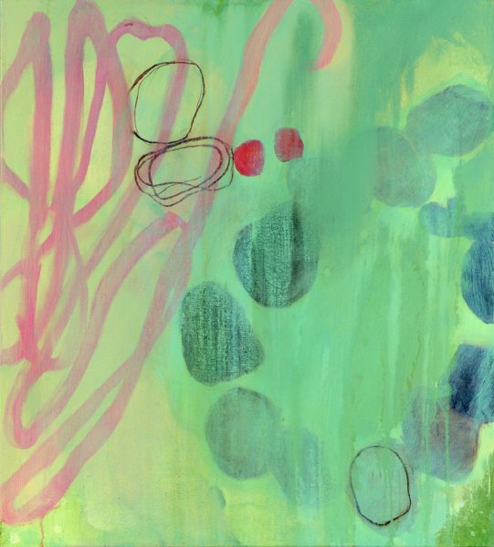
Schlaud's images present themselves as networks of balanced
opposites: openness and clutter, natural forms and personally
expressive ones, suggestions of very small or very large spaces,
bold abstraction and hints of representation, assertive forms and dissolving contours, apparent
particularity and essential oneness. All these are present in the
oil Great Circle Route (1998, oil on canvas, 29 X 26
inches), in which pale blue-gray blobs at the right are arranged
in a circle that suggests successive views of a planet in orbit.
The fanciful title — Schlaud wants her titles to be
ambiguous and suggestive, rather than limiting viewers to single
literal interpretations — evokes overseas airplane routes
whose logic can only be understood when one thinks of the Earth
as a sphere, which is to say from the perspective of outer space,
removing the viewer from terra firma and rendering her position
ambiguous. But if the right side suggests a view from the
heavens, the meandering red streak at the left, which doubles
back on itself several times, is clearly the product of a human
hand, despite its expansive sweep. Just as its calligraphic
nature encourages one to see the planets as very small marks, so
its juxtaposition with them encourages one to think of it as
enclosing a large space. A few open brown ovals are painted amid
the red streak, which mostly appears in front of them but also
appears to pass, for a brief moment, beneath one.
and dissolving contours, apparent
particularity and essential oneness. All these are present in the
oil Great Circle Route (1998, oil on canvas, 29 X 26
inches), in which pale blue-gray blobs at the right are arranged
in a circle that suggests successive views of a planet in orbit.
The fanciful title — Schlaud wants her titles to be
ambiguous and suggestive, rather than limiting viewers to single
literal interpretations — evokes overseas airplane routes
whose logic can only be understood when one thinks of the Earth
as a sphere, which is to say from the perspective of outer space,
removing the viewer from terra firma and rendering her position
ambiguous. But if the right side suggests a view from the
heavens, the meandering red streak at the left, which doubles
back on itself several times, is clearly the product of a human
hand, despite its expansive sweep. Just as its calligraphic
nature encourages one to see the planets as very small marks, so
its juxtaposition with them encourages one to think of it as
enclosing a large space. A few open brown ovals are painted amid
the red streak, which mostly appears in front of them but also
appears to pass, for a brief moment, beneath one.
These ovals are further echoed at the bottom, where another
seems to enclose a particularly indistinct "planet,"
but this is a paradoxical rather than unifying repetition: what
had appeared as abstract marks at the top becomes a potential
delineation of vast volume at the bottom. At the same time, the
planets themselves seem to be dissolving into the blue-gray field
around them: only some of their outlines are distinct, while
others trail off into streaking paint. This effect, of course,
completely undercuts the planetary illusion and regrounds the
shapes on the canvas, making them painterly constructs. The
shifting functions of shapes — the ovals are both
"over" and "under;" they are abstract but
also one seems to map a sphere — is the key to the
heterogeneity of Schlaud's paintings. Yet as with Bandwidth,
her palette is a unified one: darker red circles lead to lighter
red streaks, which themselves blend in with and reveal the yellow
behind them which, when mixed with blue-green-gray, becomes the
darker planetary field.
One additional opposition contained in much of Schlaud's work
is harder to pin down, but it might be approximated as an
opposition between the seen and the unseen. That is, despite
their uncertain and dissolving natures and the ways in which they
seem to float in space, many of Schlaud's forms seem also organic
enough to be rooted in the visible, as if inspired by things that
sat before her as she worked, things we too can touch. This sense
is both present in and undercut by the brown ovals in Great
Circle Route — undercut when we realize that while they
are open forms at the top, the one that seems to enclose a  volume at the bottom can be seen as
an idealized way of representing some essential aspect of a real
form, a sense also conveyed by the white charcoal lines in Water-worn
(1998, watercolor, graphite and charcoal, 12 X 9 inches). These
appear to sit above the cluster of bluish marks that suggest
spheres while also blending into each other. While the white
lines at times briefly harmonize with the borders of blue, more
often they go their own way, as if limning a structure we could
not otherwise see, a kind of autonomous landscape or relief map
floating above the more solid, but themselves dissolving, forms.
volume at the bottom can be seen as
an idealized way of representing some essential aspect of a real
form, a sense also conveyed by the white charcoal lines in Water-worn
(1998, watercolor, graphite and charcoal, 12 X 9 inches). These
appear to sit above the cluster of bluish marks that suggest
spheres while also blending into each other. While the white
lines at times briefly harmonize with the borders of blue, more
often they go their own way, as if limning a structure we could
not otherwise see, a kind of autonomous landscape or relief map
floating above the more solid, but themselves dissolving, forms.
Sharper lines seem to delineate the unseen in a different way
in Paisley (1998, oil on canvas, 29 X 26 inches), in which
orange seedpod shapes fill much
of the center. On the two lower ones precise outlines of what
seem like seeds are drawn in a slightly darker red. (In fact,
Schlaud did paint these from seedpods, and the "seeds"
from corn kernels.) Here the impression is not of some imagined
but unseeable structure, but of looking through the pods' skin to
seeds inside, a sensation heightened by the way the pods seem
illuminated from behind: the spaces next to them are an even
brighter orange, as if light is shining around, and perhaps also
through, them. Again, colors that appear contrasting at first
— the brownish line in the upper center and the orange
behind it — seem integrated via intermediate hues that make
them almost seem shades of each other. What is more, on the
surface of the pod to the left of the brown line, some of the
darker paint has been scraped away — Schlaud uses the tip of
her brush handle for this — to extraordinary effect. Since
the scrapings extend to an adjacent pod, one cannot read this as
a natural feature of the surface; it can only be a hand-scraped
line. But insofar as it mirrors the longer darker line to its
right, it extends the principle of color-equivalence to an
entirely different aspect of the composition. With this technique
adding and subtracting paint are also presented as mirrors of
each other, and painterly effects are paralleled with natural
forms; in nature, of course, growth and decay are inextricably
linked. At its deepest level, and like most of these works, Paisley
moves from being a study in heterogeneous forms to an almost
spiritual window onto a deeper connectedness.
seedpod shapes fill much
of the center. On the two lower ones precise outlines of what
seem like seeds are drawn in a slightly darker red. (In fact,
Schlaud did paint these from seedpods, and the "seeds"
from corn kernels.) Here the impression is not of some imagined
but unseeable structure, but of looking through the pods' skin to
seeds inside, a sensation heightened by the way the pods seem
illuminated from behind: the spaces next to them are an even
brighter orange, as if light is shining around, and perhaps also
through, them. Again, colors that appear contrasting at first
— the brownish line in the upper center and the orange
behind it — seem integrated via intermediate hues that make
them almost seem shades of each other. What is more, on the
surface of the pod to the left of the brown line, some of the
darker paint has been scraped away — Schlaud uses the tip of
her brush handle for this — to extraordinary effect. Since
the scrapings extend to an adjacent pod, one cannot read this as
a natural feature of the surface; it can only be a hand-scraped
line. But insofar as it mirrors the longer darker line to its
right, it extends the principle of color-equivalence to an
entirely different aspect of the composition. With this technique
adding and subtracting paint are also presented as mirrors of
each other, and painterly effects are paralleled with natural
forms; in nature, of course, growth and decay are inextricably
linked. At its deepest level, and like most of these works, Paisley
moves from being a study in heterogeneous forms to an almost
spiritual window onto a deeper connectedness.
That many of Schlaud's forms seem to be drawn from nature is
not surprising, considering her background. Raised in rural
Michigan, where her parents had a small farm, she was given a
tiny plot on which to plant her own things — "silly
flowers, anything I wanted, pumpkins and irises," she
recalled to the author of this essay in June 1998. She made
quilts and canned fruits and vegetables and was a member of the
4-H, and became "really nostalgic for plants" when she
first began living in towns and cities. In fall, "the leaves
of the corn would turn purple and yellow, these wonderful bright
colors. I thought this was the most gorgeous thing, and I would
collect them," though in her large family only her mother
seemed interested. At seven or eight she was also taken to see a
monument to the Virgin Mary that her grandfather had made; on the
pathway that led up to it, into each little circle of cement, he
had imprinted or embedded things such as a strand of wheat, or
one of his tools. She learned from a printmaker in her hometown,
Don Morey, who encouraged her to seek a "more gestural"
line, and today she recalls loving her grandmother's handwriting
"when she was old — it got very wiggly and
erratic." In 1990 she met the painter Vincent Pimentel,
whose abstract paintings included "dirt from all over the
world. He would say, 'You have to let a line just be there; do it
once and don't redo it.'" Soon after, Schlaud's work turned
abstract.
Though her work is abstract, and though she doesn't want to
pin down the viewer to specific associations with her forms, it
seems clear that Schlaud's art is profoundly influenced by nature
and nature's principles. Not only are her shapes primarily
organic rather than Euclidean; her compositions' almost
inventory-like development of varieties of difference and
sameness suggests taxonomic principles. A row of shapes will
resemble each other, each with a slightly different form, and yet
suddenly branch off, as if making a new evolutionary leap (as
with the two smaller red circles above the ring of darker ones in
Great Circle Route). Similarly, rather than catering to
one popular view of "nature" as static picture-window
views of pretty plants, Schlaud mirrors nature more profoundly by
modeling it as it exists over time, in her subtle yet sometimes
dramatic enjambment of congealing and decaying forms.
Schlaud notes her own attraction "to awkwardness,
misshapedness; the way the junk of nature, shells, sticks, has
this wonderful beauty." A few years ago she found a
confirmation of her aesthetic in Leonard Koren's Wabi-Sabi for
Artists, Designers, Poets & Philosophers, a book which
attempts to define the often-used Japanese term.
"Irregular," " suggestion of natural
process," and "ignore material hierarchy" are
among the phrases that appear in its section headings.
"Things are either devolving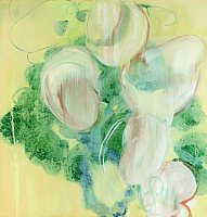 toward, or evolving from, nothingness," we
learn — and that's also a good description of Schlaud's
forms, which are never static, never precisely defined, and often
seem to be congealing and decaying at once. In Atlas Marker
(1998, oil on canvas, 28 X 27 inches), a group of whitish,
cell-like shapes seem to hover over a darker blue-gray field,
which itself seems to be just above a yellowish ground. The
yellow itself is a maze of varied tones; the blue-gray mass looks
as if its circles are both congealing and separating, at once
recalling dividing cells and inkblots that, spilling over into
one another, are merging. The white cells above have Schlaud's
characteristic ambiguities: some paint is scraped away in lines
that resemble the brushstrokes by which paint has been added;
some are opaque, hiding the blue-gray mass; others are so
transparent that the background can be seen clearly through part
of them. The blue-gray itself is highly mottled, streaked and
flecked with the yellow; in fact, Schlaud poured turpentine onto
it, causing some of the original paint to disappear and creating
this natural-looking background. This mass, composed of separate
forms that are coming together, is also decaying into a surface
more random than that of moss, or lichen.
toward, or evolving from, nothingness," we
learn — and that's also a good description of Schlaud's
forms, which are never static, never precisely defined, and often
seem to be congealing and decaying at once. In Atlas Marker
(1998, oil on canvas, 28 X 27 inches), a group of whitish,
cell-like shapes seem to hover over a darker blue-gray field,
which itself seems to be just above a yellowish ground. The
yellow itself is a maze of varied tones; the blue-gray mass looks
as if its circles are both congealing and separating, at once
recalling dividing cells and inkblots that, spilling over into
one another, are merging. The white cells above have Schlaud's
characteristic ambiguities: some paint is scraped away in lines
that resemble the brushstrokes by which paint has been added;
some are opaque, hiding the blue-gray mass; others are so
transparent that the background can be seen clearly through part
of them. The blue-gray itself is highly mottled, streaked and
flecked with the yellow; in fact, Schlaud poured turpentine onto
it, causing some of the original paint to disappear and creating
this natural-looking background. This mass, composed of separate
forms that are coming together, is also decaying into a surface
more random than that of moss, or lichen.
What finally brings all of Schlaud's themes and implied
references together, and what finally accounts for the strength
and originality of her art, is the particular way in which her
forms succeed on a purely aesthetic level, as paint. This curving
line, that amorphous ellipse, may draw on expressionist,
formalist, and nature-based traditions of abstraction, but they
also have an almost unaccountable dynamic life of their own.
Abjuring both the personal, emotionalized shapes of expressionism
and the vision of nature as perfection implied by much
nature-inspired abstraction, the artist creates streaks and
shapes whose slightly unruly imperfections point in two
directions — growth toward organized symmetry and decay
toward undifferentiated color — at once. The characteristics
of paint — the ways in which it mixes, streaks, drips —
become as important as those of nature; in Schlaud's work, the
two are also linked. The snaking lines, too, never seem to settle
into simple, predictable or "perfected" patterns;
instead, they loop around and back on themselves, twisting
uneasily from one curl to the next, as if a controlled hand is
seeking poetry in jaggedness and asymmetry. The result is an art
that doesn't declare its forms as absolutes — pace Malevich
or Mondrian — or as truths of the private soul, in the
manner of Rothko. Instead, Schlaud's forms push out and draw
themselves back, seem ready to collapse into chaotic disorder at
the very moment they seem to be coming together toward some kind
of completion. This is an art that, rather than seizing territory
for itself and declaring its universality, presents itself as
provisional visions of an ever-changing flux that can never be
fully captured.
This principle is perhaps best conveyed by Mimic
(1998, oil on canvas, 24 X 22 inches), whose hint of self-mocking
humor matches the weirdly
adumbrated iconic power of its two principal forms, a dark brown
blob on the left punctuated with darker spots on its surface and
a glowing yellow blob next to it on the right, partly outlined by
a red curving line within it. The joke of the title is that these
shapes don't, beyond the roughest of similarities, imitate each
other at all: one is dark, the other light; one has a spotty
surface, the other shines. Physically similar in size and in
shape, they carry heterogeneity to an extreme, seeming to come
from different representational systems, or different worlds.
Each hovers forcefully above the painting's lower reaches,
recalling Adolph Gottlieb. But Gottlieb's orbs have an
absoluteness, appearing as suns that sit as if at the center of
the universe, while these two forms are profoundly undercut. As
she often does, Schlaud poured turpentine on her paint, which
then caused much of it to drip. Not only do drips almost fill the
lower half: parts of the two spheres are also eaten away, leaving
empty streaks crossing them, revealing the colors that were
behind. The drips here do more than de-iconize the forms, they
also connect them. Despite their differences, they now share the
destiny that time holds for all paint, and ultimately all things:
they are themselves dissolving.
matches the weirdly
adumbrated iconic power of its two principal forms, a dark brown
blob on the left punctuated with darker spots on its surface and
a glowing yellow blob next to it on the right, partly outlined by
a red curving line within it. The joke of the title is that these
shapes don't, beyond the roughest of similarities, imitate each
other at all: one is dark, the other light; one has a spotty
surface, the other shines. Physically similar in size and in
shape, they carry heterogeneity to an extreme, seeming to come
from different representational systems, or different worlds.
Each hovers forcefully above the painting's lower reaches,
recalling Adolph Gottlieb. But Gottlieb's orbs have an
absoluteness, appearing as suns that sit as if at the center of
the universe, while these two forms are profoundly undercut. As
she often does, Schlaud poured turpentine on her paint, which
then caused much of it to drip. Not only do drips almost fill the
lower half: parts of the two spheres are also eaten away, leaving
empty streaks crossing them, revealing the colors that were
behind. The drips here do more than de-iconize the forms, they
also connect them. Despite their differences, they now share the
destiny that time holds for all paint, and ultimately all things:
they are themselves dissolving.
© Copyright Fred Camper 1998
Home Film My Art
Art
Other: (Travel, Rants, Obits)
Links About
Contact
 Bandwidth
(1998, watercolor, graphite, gouache, and ink, 16 X 12
inches) sings with organic lines and shapes — an almost
calligraphic curving red line, translucent brown streaks, a pale
yellow field. At the same time that one starts to notice how
utterly different the shapes are from each other, one also
notices that the colors, which at first glance appear as separate
shades of red, tan, yellow, and blue-gray, actually work to unify
the image. The light yellow is also present in somewhat darker
shades, which glide into the lighter shades of tan — they
are even superimposed at the lower left — which in turn lead
to the darker shades of tan, which themselves contain hints of
the red. Rather than a series of contrasts, then, Schlaud's
colors also suggest a continuum.
Bandwidth
(1998, watercolor, graphite, gouache, and ink, 16 X 12
inches) sings with organic lines and shapes — an almost
calligraphic curving red line, translucent brown streaks, a pale
yellow field. At the same time that one starts to notice how
utterly different the shapes are from each other, one also
notices that the colors, which at first glance appear as separate
shades of red, tan, yellow, and blue-gray, actually work to unify
the image. The light yellow is also present in somewhat darker
shades, which glide into the lighter shades of tan — they
are even superimposed at the lower left — which in turn lead
to the darker shades of tan, which themselves contain hints of
the red. Rather than a series of contrasts, then, Schlaud's
colors also suggest a continuum.